
The last couple of days, I’ve written about my idea for a three shell game style routine to be done onstage. The basic premise is that the prize is put into a tennis ball that has a slit cut into it and it’s juggled with two other balls and the audience has to follow the one with the prize.
You can read about the idea here and how I solved one of the problems here.
A challenge that I didn’t think about with using a two dollar bill and a couple of one dollar bills is that they are visually similar when viewed from a distance. The different formatting of a five and higher value bill looks different, however a $1 and $2 have the same layout.
How Can They Look Different From a Distance?
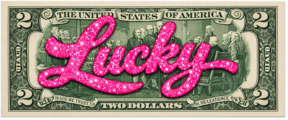
This is the challenge, making the trick play to the back row. Here’s an idea for the solution to that: What if on the back of the two dollar bill in bright, sparkly ink/paint I wrote “LUCKY”? I could introduce the two dollar bill and say it’s my lucky one, then turn it around to show the word on the back. That visual difference would make it play further back in an audience.
When I create routines, I always try to think about the back row!
-Louie